From Annual Report to Year-Round Digital Content: A Nonprofit Guide

Annual report to year round digital content

How to turn your impact data into infographics, social posts, and email campaigns that keep donors engaged all year

TL;DR: What You Will Learn

A nonprofit annual report should not be the end of your communication cycle. It should be the beginning of a year-long content system. Most reports already contain the strongest material an organisation has: verified impact numbers, beneficiary stories, financial transparency, program milestones and proof of credibility. But when that work stays locked inside a PDF, it reaches only a small fraction of the people who could engage with it, share it, fund it or act on it. Repurposing your annual report helps turn one approved document into a steady stream of blogs, infographics, social posts, donor emails and campaign assets that keep your impact visible long after publication day

•       Your annual report takes 30 to 60 staff hours to produce. Less than 10% of recipients actually read it. A repurposing plan changes that ratio completely.

•       Every annual report contains at least four content buckets: impact numbers, financial transparency data, beneficiary stories, and program milestones. Each one maps directly to a format your donors and supporters are already engaging with.

•       The five steps in this guide will help your nonprofit build a 12-month content calendar from a single report without creating anything new from scratch.

Your nonprofit just spent 30 to 60 staff hours on the annual report. You published it, sent one email, posted the PDF link on social media, and moved on.

Less than 10% of the people who received that email actually opened it — and even fewer clicked through to read the report (Kristin Beltaos, Repurpose Your Nonprofit Annual Report: 90-Day Plan, 2025).

That is not a report problem. It is a distribution problem.

Your annual report is the single richest content asset your nonprofit produces all year. It has your strongest impact numbers. It has stories that move people.It has the financial transparency that 24% of donors who stopped giving said they needed and never got (Bloomerang, Mission Retainable Report, 2024). All of it is sitting in a PDF that most of your audience will never open.

This guide shows you how to change that. Not by working harder. By working with what you already have.

Why Most Nonprofits Leave Their Best Content on the Table

78% of donors expect a nonprofit to publish an annual report before they decide to give (Funraise, 2024). Most nonprofits do publish one. But almost none have a plan for what comes next.

The sector data tells a consistent story. Nonprofits that communicate impact consistently retain donors at dramatically higher rates. Donors who receive regular impact updates report feeling significantly more connected to the organisations they support. Nonprofits that display transparent financial data earn substantially more in contributions than those that do not.

In fact, organisations that display a Candid Seal of Transparency average 62% more in donor contributions than those without, based on a 2024 analysis of 148,786 nonprofits (Candid, 2024). The annual report is the most credible transparency document your nonprofit produces. When you bury it in a PDF and move on, you leave all of that trust-building potential unused.

The problem is not the report itself. The problem is the belief that publishing it is the finish line. It is actually the starting point.

According to D4NP'sState of Nonprofits Digitization Report 2025, 80% of India's top 100 nonprofits score low on digital maturity. One of the most consistent gaps is inconsistent communication between campaigns. Nonprofits go quiet after a big push. Donors disengage. Repurposing your annual report is the lowest-effort, highest-return way to close that gap.

Step 1: Audit Your Report Into Four Content Buckets

Before you repurpose anything, you need to know what you have. Open your report and sort every piece of content into one of these four buckets. This audit takes two hours and produces the raw material for everything that follows.

Content Bucket

What to Pull from the Report

Best Content Formats

Impact Numbers

People served, programs run, reach, outcomes measured, year-over-year comparisons

Infographic, LinkedIn stat carousel, email subject line hook, Instagram reel

Financial Transparency

% of funds to programs, funding sources, cost-per-beneficiary, year-on-year budget shifts

Pie chart post, donor email section, blog transparency post, FAQ answer

Beneficiary Stories

Named or anonymised case studies, quotes, and before-and-after program journeys

Long-form blog post, email story sequence, testimonial carousel, WhatsApp forward

Program Milestones

New initiatives launched, geographies entered, partnerships formed, and awards received

LinkedIn post, newsletter section, press note, Instagram story series

Do not try to repurpose everything at once. From each bucket, pick two or three items that are specific, verifiable, and emotionally resonant. Those are your content anchors for the next 90 days.

A note on what makes a stat repurposable

Not every number in your annual report will travel well. The ones that do share three qualities: they are specific (not 'thousands of people' but '14,200 people across 9 states'), they are comparable (this year versus last year, or versus a sector benchmark), and they are connected to a human outcome (not 'we distributed 5,000 kits' but '5,000 kits reached families who had not eaten in three days').

Charity: water GPS-tags every water project it funds and photographs it for later repurposing. The number 37,770 people gained access to clean water from one campaign is specific, visual, and inseparable from the story behind it. That is the standard to aim for.

Step 2: Turn Impact Numbers into Shareable Infographics

Infographics are the fastest way to make your annual report data travel. They work across LinkedIn, Instagram, email headers, event presentations, and funder decks without needing to be remade each time.

The one-stat-one-visual rule

The most common mistake nonprofits make with infographics is trying to fit the entire report into one visual. A single strong stat paired with a clean visual outperforms a complex data poster every time. Your goal is not to summarise. Your goal is to make one number so clear and compelling that someone shares it without reading another word.

Pratham's Annual Status of Education Report does this well. The 2024 ASER data includes specific, nationally significant numbers such as the proportion of Class 3 students reading at grade level. Extracted individually, each of those numbers becomes a shareable graphic that can run across social channels, email newsletters, and advocacy documents for months.

Free tools your team can use today

Canva for Nonprofits is free for up to 50 users with full Pro features, brand kits, and 400,000+ templates. Apply through canva.com/canva-for-nonprofits/. Adobe Express for Nonprofits is also free for up to 50 users with 160M+ stock photos and AI features. Datawrapper and Flourish are free for charts and data visualisations with a dedicated 'Data Viz for Good' programme for nonprofits. If your team has Microsoft for Nonprofits access, Microsoft Designer is included.

D4NP helps nonprofits unlock these tools through tech grants, so most of this suite is available at zero cost to eligible organisations.

Alt text is not optional

Every infographic you publish online needs descriptive alt text. This matters for accessibility and for SEO. Screen readers announce images to visually impaired users; search engines index the alt text to understand what the image contains.

The formula: [chart type] + [what it shows] + [key data point]. For example: 'Bar chart showing 2024 reach by state: 14,200 beneficiaries across Gujarat, Maharashtra, and Rajasthan.' That is specific enough to be useful and short enough to stay under 125 characters.
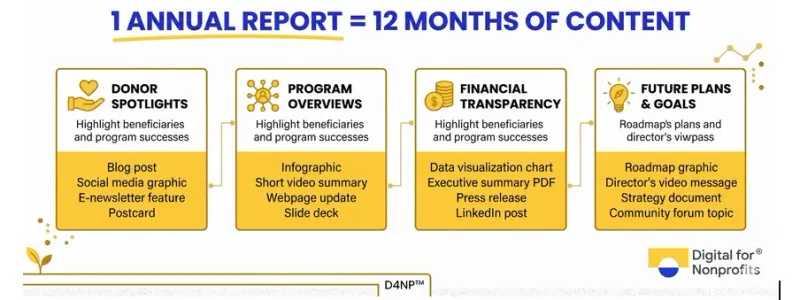
1 annual report= 12 months of contetnt

Step 3: Build Social Media Snippets That Actually Get Engagement

Every nonprofit is on social media. Most are posting inconsistently, with content that starts from scratch every week. Your annual report solves that problem. Here is how to extract platform-specific content from the same source material.

Platform-by-platform guide

Platform

Best Annual Report Content and Format

LinkedIn

Multi-stat impact carousels built as PDF documents (one stat per slide, 5 to 8 slides). LinkedIn document carousels hit an average 6.6 to 7.0% engagement rate in 2026  14% higher than the previous year (Socialinsider, 2026). Your financial transparency section and year-over-year impact comparison work particularly well here. 

Instagram

Static infographic tiles for the feed using single impact stats. Carousels earn 109% more engagement per person reached than Reels on Instagram (Buffer, 2026). Instagram reaches 15.3% of followers organically per post, compared to 2.2% on Facebook (Social Status, 2024-25) .making it the highest-reach platform for organic content. Reels using beneficiary story snippets extend reach to non-followers.

Facebook

Donor-focused posts that frame your numbers around what supporters made possible. 'Your donations helped us serve 14,200 people this year' outperforms a raw statistic. Photo posts get shared 3x more than other formats on Facebook for nonprofits (Rival IQ, 2025). Keep it warm and specific.

WhatsApp (India)

One-page micro-reports as PDFs or shareable image cards for donor communities. India has 853.8 million WhatsApp users (DemandSage, 2025). For Indian nonprofits, WhatsApp is often the most direct channel to donors, volunteers, and partner organisations. Short, mobile-optimised, vernacular content travels further than a formal PDF link.

Email

Subject lines built from your headline stat. 'We fed 2.2 million children this year' outperforms any generic subject line. Link back to the full report, the impact page, or a specific program deep-dive.

A word on organic reach in 2026

Organic reach has declined across every platform. Nonprofit posts now reach roughly 2.2% of Facebook followers and 2.9% of LinkedIn followers per post . That is not a reason to stop posting  it is a reason to make every post count, to post consistently, and to build your email list in parallel so you own a direct channel that algorithms cannot throttle.

If your nonprofit has access to a Google Ad Grant  up to $10,000 per month in free search advertising  you can drive qualified traffic to a dedicated annual report landing page and use that as the hub for all repurposed content. D4NP helps nonprofits activate and manage this grant through ourHow We Work programme.

Step 4: Turn Report Sections into Blog Posts and Email Campaigns

Your annual report's program sections are already blog posts. They have a challenge, an intervention, an outcome, and often a quote from someone whose life changed. All they need is a narrative frame and a search-optimised title.

From program section to SEO blog post

Take any major program in your annual report. In the report, it is two paragraphs and a stat. Expanded into a blog post, it becomes a 1,000 to 1,500-word article that answers the questions your donors, funders, and volunteers are already searching for.

For example, a program section covering digital literacy training for women becomes 'How We Trained 3,000 Women in Digital Skills Across Four States: What We Learned'. That blog post is searchable, evergreen, and builds your topical authority on the issue. It also earns organic traffic for months after publication, whereas a social post disappears in 48 hours.

Repeat this for every major program. One annual report with five program sections gives you five blog posts ready to publish across the year. Link them back to each other and to your core service pages, and you have a content cluster that signals topical authority to search engines and AI systems alike.

A four-week email sequence from one annual report

Instead of sending a single email with a PDF link, break your annual report into a four-week drip. Each email focuses on one piece of the story and requires no new content creation.

Week

Email Focus and Goal

Week 1: The Big Picture

Lead with your single strongest impact stat. Connect it directly to your donors' contribution. Keep it to 150 words. Subject line: the number itself. This is the top-of-funnel open you are competing for.

Week 2: The Human Story

One beneficiary story from your report, told in first-person voice if possible. No statistics. Just one person, one change, told in 200 words. This is the email that donors forward.

Week 3: The Honest Numbers

A plain-English breakdown of how funds were used. Include one chart or simple ratio. '83 paise of every rupee went directly to programs.' Transparency is the single biggest retention lever you have.

Week 4: What Comes Next

Your priorities for the coming year. One specific funding ask tied to a concrete outcome. This is your lightest-touch call to action of the four-week sequence  because you have already done the trust-building.

Nonprofit email open rates average 28.59%, with a click-through rate of 3.29% (Neon One Nonprofit Email Report, based on 37,472 campaigns). These numbers depend heavily on list quality, subject line, and sender reputation  but the single biggest driver of performance is relevance. An email about a real story from your real work outperforms a generic newsletter every time.

65% of donors say regular impact updates make them feel connected to the organisations they support (Bloomerang, Mission Retainable Report, 2024). A four-week post-report email sequence is not a sales funnel. It is how you maintain that connection between asks.

Step 5: Build a 12-Month Content Calendar from One Report

Once you know what you have, what formats to use, and which channels to prioritise, the last step is scheduling. A single annual report can fuel a full calendar year of consistent, credible content. Here is how a realistic quarterly plan looks.

Quarter

Content Focus

Formats

Q1 (Jan-Mar): Launch

Full report release. Headline impact stat. Financial summary. Donor thank-yous.

Blog post, infographic, 4-week email drip, LinkedIn carousel, Facebook photo posts

Q2 (Apr-Jun): Deep Dives

One program section per month becomes a long-form blog. Beneficiary stories lead.

Long-form blog cluster, testimonial carousels on Instagram, LinkedIn thought-leadership posts

Q3 (Jul-Sep): Progress

Mid-year updates linked back to annual report goals. Keep momentum between campaigns.

Email newsletter, Instagram stat series, WhatsApp donor community updates, YouTube program video

Q4 (Oct-Dec): Giving Season

Annual report proof points as credibility anchors for year-end fundraising. Your data becomes your ask.

Fundraising emails with impact stats, LinkedIn impact carousels, donor recognition posts, social ads

Content repurposing maximizes ROI by transforming one asset into multiple formats, extending reach without extra creation costs. The mathematics are straightforward: the cost of production is fixed at 30 to 60 hours. Every additional piece of content extracted from that investment reduces the cost per content unit.

This is particularly relevant for Indian nonprofits. The Bain-Dasra India Philanthropy Report 2024 shows that retail giving in India grew 12% in FY2023, with 25 to 30% growth specifically in digital donations through UPI and online platforms. That donor base expects to see proof of impact before they give again. Your annual report is that proof. A content calendar ensures they see it.

Need help building your content system?

D4NP works with nonprofits at every stage of digital maturity to help them build content systems that are sustainable, measurable, and owned by their own teams. If your organisation is ready to activate a Google Ad Grant, set up an email system, or build a content calendar grounded in your actual impact data, take ourfree tech assessment to see exactly where to start.

Your Annual Report Already Has Everything You Need

The annual report you have already written is enough. It has the numbers. It has the stories. It has the financial data that builds donor trust. All of it is already verified, approved, and ready.

What most nonprofits are missing is not content. It is a system for extending that content across channels, formats, and months. The five steps in this guide give you that system.

Sort your content into buckets. Turn the strongest stat into an infographic. Build the LinkedIn carousel. Send the four-week email sequence. Expand each program section into a blog post. Schedule it across four quarters so your mission stays visible between campaigns and year-end asks.

Donors who hear from a nonprofit regularly between campaigns are significantly more likely to give again. Organisations that communicate impact consistently retain donors at rates that compound over time. The first-time donor retention rate for the nonprofit sector sits at just 14% (Fundraising Effectiveness Project, 2025). The fastest, most cost-effective way to move that number is consistent, specific, impact-led communication  which your annual report already makes possible.

You did the hard work. Now make it count.

Want to talk through your repurposing strategy?

D4NP partners with nonprofits across India to build digital content systems that are self-reliant, not dependent. Reach us atdigitalfornonprofits.com to start a conversation.

Frequently Asked Questions

What does it mean to repurpose nonprofit annual report content?
Repurposing means taking the data, stories, and milestones already published in your annual report and reformatting them for distribution across other channels throughout the year. Instead of publishing once and archiving, you extract individual elements and turn them into social posts, blog articles, email campaigns, and infographics. The source material stays the same. The format and context change to fit the platform and the moment.
How many content pieces can one annual report generate?
A standard 10-page nonprofit annual report can generate 15 to 25 individual content pieces. This includes 4 to 6 blog posts built from program sections, 8 to 12 social posts, a 4-week email sequence, and 3 to 5 standalone infographics. Spread across 12 months, that is more than enough to maintain consistent communication without creating new material from scratch each month.
Is repurposing annual report content bad for SEO?
No — as long as you rewrite and reformat rather than copy-paste verbatim. Transformed content, meaning the same underlying data presented in a new format or expanded with additional context, is not flagged as duplicate content by search engines. Building multiple pieces of content around the same core theme actually helps establish topical authority, which is a key driver of organic search rankings for informational queries.
Which social media platform should nonprofits prioritise for impact data?
LinkedIn is the strongest platform for data-rich, impact-led content. Document carousels on LinkedIn averaged 6.6 to 7.0% engagement in 2026 (Socialinsider), and 42% of US donors use LinkedIn to research nonprofits before giving (Classy/GoFundMe Pro). For organic reach and new-audience discovery, Instagram reaches 15.3% of followers per post organically, compared to 2.9% on LinkedIn and 2.2% on Facebook. For Indian nonprofits, WhatsApp is the additional essential channel that global benchmarks underweight.
What is a digital impact report for nonprofits?
digital impact report is an online-first version of a traditional annual report. Instead of a PDF, it is presented as an interactive webpage, a microsite, or a combination of infographics and short-form media. Digital formats allow embedded video, clickable infographics, mobile-optimised layouts, and social sharing of individual data points. Organisations like Akshaya Patra Foundation publish their annual reports in three simultaneous formats: narrated video, PDF, and interactive Flipbook.
How do I create infographics if my team has no design skills?
Canva for Nonprofits provides free access to full Pro features including 400,000+ templates, Magic Resize, brand kits, and team collaboration for up to 50 users. Adobe Express for Nonprofits offers similar free access. Both require an application process to verify charitable status, but once approved, the tools are free on an ongoing basis. Flourish and Datawrapper are additional free options specifically for chart and data visualisation. D4NP helps eligible nonprofits apply for these tools as part of the tech grants activation process.
What email benchmarks should Indian nonprofits target?
Average nonprofit email open rates run 28.59% overall, with smaller lists performing significantly higher (Neon One, based on 157M+ emails). Click-through rates average 3.29% across nonprofits. For Indian NGOs, the more actionable metric is mobile open rate: with smartphone penetration and mobile internet usage both over 80% in urban India (IAMAI-Kantar, 2024), every email must render cleanly on a 5-inch screen. Subject lines with specific numbers — '14,200 lives changed this year' — consistently outperform generic alternatives.
How does repurposing annual report content support donor retention?
The sector's donor retention crisis is structural. First-time donor retention has fallen to 14% (Fundraising Effectiveness Project, 2025). Donors who receive consistent, specific impact communication are significantly more likely to give again. 65% of donors say regular impact updates make them feel connected to the nonprofits they support (Bloomerang, 2024). A content calendar built from your annual report ensures there is always a reason to reach out — and that every communication is grounded in real, verified impact rather than a generic ask.
How does this work for small nonprofits with limited teams?
Content repurposing is especially valuable for small teams. A one-person communications team cannot generate original content daily. But that same team can build a three-month content plan in a single afternoon by sorting one annual report into buckets and scheduling the output. The annual report has already passed through leadership review and verification. Every piece of content extracted from it inherits that credibility without requiring a new approval cycle.
What role does WhatsApp play in Indian nonprofit content distribution?
India has 853.8 million WhatsApp users the largest base in the world (DemandSage, 2025). For most Indian NGOs, WhatsApp is the primary channel for direct communication with donor communities, volunteer groups, and field partners. Short, mobile-optimised content derived from the annual report travels exceptionally well here: a one-page micro-report as a PDF, an impact image card, or a brief audio message from the founder or program lead. Nonprofits using WhatsApp Business API for structured donor outreach report up to 48% increases in annual donations and 40% increases in donor engagement (Gallabox / Doubletick, 2024).

This is the lead-generation form

Get info from your blog visitors for lead funnel

Blogs | Digital for Nonprofits

Digital For Nonprofits (D4NP) leverages technology grants, digital marketing, and Generative AI to make nonprofits self-reliant.